Forms are the mainstay of business applications. You use forms to log in, submit a help request, place an order, book a flight, schedule a meeting, and perform countless other data-entry tasks.
表单是商业应用的支柱,我们用它来执行登录、求助、下单、预订机票、安排会议,以及不计其数的其它数据录入任务。
In developing a form, it's important to create a data-entry experience that guides the user efficiently and effectively through the workflow.
在开发表单时,创建数据方面的体验是非常重要的,它能指引用户明细、高效的完成工作流程。
Developing forms requires design skills (which are out of scope for this page), as well as framework support for two-way data binding, change tracking, validation, and error handling, which you'll learn about on this page.
开发表单需要设计能力(那超出了本章的范围),而框架支持双向数据绑定、变更检测、验证和错误处理,而本章我们会接触到它们。
This page shows you how to build a simple form from scratch. Along the way you'll learn how to:
这个页面演示了如何从草稿构建一个简单的表单。这个过程中你将学会如何:
Build an Angular form with a component and template.
用组件和模板构建 Angular 表单
Use
ngModelto create two-way data bindings for reading and writing input-control values.用
ngModel创建双向数据绑定,以读取和写入输入控件的值Track state changes and the validity of form controls.
跟踪状态的变化,并验证表单控件
Provide visual feedback using special CSS classes that track the state of the controls.
使用特殊的CSS类来跟踪控件的状态并给出视觉反馈
Display validation errors to users and enable/disable form controls.
向用户显示验证错误提示,以及启用/禁用表单控件
Share information across HTML elements using template reference variables.
使用模板引用变量在 HTML 元素之间共享信息
You can run the
你可以在Plunker中运行
Template-driven forms
模板驱动的表单
You can build forms by writing templates in the Angular template syntax with the form-specific directives and techniques described in this page.
通常,使用 Angular 模板语法编写模板,结合本章所描述的表单专用指令和技术来构建表单。
You can also use a reactive (or model-driven) approach to build forms. However, this page focuses on template-driven forms.
你还可以使用响应式(也叫模型驱动)的方式来构建表单。不过本章中只介绍模板驱动表单。
You can build almost any form with an Angular template—login forms, contact forms, and pretty much any business form. You can lay out the controls creatively, bind them to data, specify validation rules and display validation errors, conditionally enable or disable specific controls, trigger built-in visual feedback, and much more.
利用 Angular 模板,可以构建几乎所有表单 — 登录表单、联系人表单…… 以及任何的商务表单。 可以创造性的摆放各种控件、把它们绑定到数据、指定校验规则、显示校验错误、有条件的禁用或 启用特定的控件、触发内置的视觉反馈等等,不胜枚举。
Angular makes the process easy by handling many of the repetitive, boilerplate tasks you'd otherwise wrestle with yourself.
它用起来很简单,这是因为 Angular 处理了大多数重复、单调的任务,这让我们可以不必亲自操刀、身陷其中。
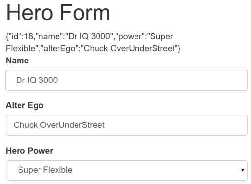
You'll learn to build a template-driven form that looks like this:
我们将学习构建如下的“模板驱动”表单:
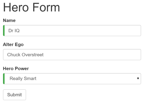
The Hero Employment Agency uses this form to maintain personal information about heroes. Every hero needs a job. It's the company mission to match the right hero with the right crisis.
这里是英雄职业介绍所,使用这个表单来维护候选英雄们的个人信息。每个英雄都需要一份工作。 公司的任务就是让适当的英雄去解决它/她所擅长应对的危机!
Two of the three fields on this form are required. Required fields have a green bar on the left to make them easy to spot.
表单中的三个字段,其中两个是必填的。必填的字段在左侧有个绿色的竖条,方便用户分辨哪些是必填项。
If you delete the hero name, the form displays a validation error in an attention-grabbing style:
如果删除了英雄的名字,表单就会用醒目的样式把验证错误显示出来。
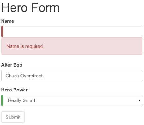
Note that the Submit button is disabled, and the "required" bar to the left of the input control changes from green to red.
注意,提交按钮被禁用了,而且输入控件左侧的“必填”条从绿色变为了红色。
You can customize the colors and location of the "required" bar with standard CSS.
稍后,会使用标准 CSS 来定制“必填”条的颜色和位置。
You'll build this form in small steps:
我们将一点点构建出此表单:
Create the
Heromodel class.创建
Hero模型类Create the component that controls the form.
创建控制此表单的组件。
Create a template with the initial form layout.
创建具有初始表单布局的模板。
Bind data properties to each form control using the
ngModeltwo-way data-binding syntax.使用
ngModel双向数据绑定语法把数据属性绑定到每个表单输入控件。Add a
nameattribute to each form-input control.往每个表单输入控件上添加
name属性 (attribute)。Add custom CSS to provide visual feedback.
添加自定义 CSS 来提供视觉反馈。
Show and hide validation-error messages.
显示和隐藏有效性验证的错误信息。
Handle form submission with ngSubmit.
使用 ngSubmit 处理表单提交。
Disable the form’s Submit button until the form is valid.
禁用此表单的提交按钮,直到表单变为有效。
Setup
搭建
Follow the setup instructions for creating a new project named angular-forms.
按照搭建本地开发环境的说明,创建一个名为angular-forms的新项目。
Create the Hero model class
创建 Hero 模型类
As users enter form data, you'll capture their changes and update an instance of a model. You can't lay out the form until you know what the model looks like.
当用户输入表单数据时,需要捕获它们的变化,并更新到模型的实例中。 除非知道模型里有什么,否则无法设计表单的布局。
A model can be as simple as a "property bag" that holds facts about a thing of application importance.
That describes well the Hero class with its three required fields (id, name, power)
and one optional field (alterEgo).
最简单的模型是个“属性包”,用来存放应用中一件事物的事实。
这里使用三个必备字段 (id、name、power),和一个可选字段 (alterEgo,译注:中文含义是第二人格,例如 X 战警中的 Jean / 黑凤凰)。
In the app directory, create the following file with the given content:
在应用文件夹中创建下列文件:
src/app/hero.ts
It's an anemic model with few requirements and no behavior. Perfect for the demo.
这是一个少量需求和零行为的贫血模型。对演示来说很完美。
The TypeScript compiler generates a public field for each public constructor parameter and
automatically assigns the parameter’s value to that field when you create heroes.
TypeScript 编译器为每个public构造函数参数生成一个公共字段,在创建新的英雄实例时,自动把参数值赋给这些公共字段。
The alterEgo is optional, so the constructor lets you omit it; note the question mark (?) in alterEgo?.
alterEgo是可选的,调用构造函数时可省略,注意alterEgo?中的问号 (?)。
You can create a new hero like this:
可以这样创建新英雄:
Create a form component
创建表单组件
An Angular form has two parts: an HTML-based template and a component class to handle data and user interactions programmatically. Begin with the class because it states, in brief, what the hero editor can do.
Angular 表单分为两部分:基于 HTML 的模板和组件类,用来程序处理数据和用户交互。 先从组件类开始,是因为它可以简要说明英雄编辑器能做什么。
Create the following file with the given content:
创建下列文件:
src/app/hero-form.component.ts (v1)
There’s nothing special about this component, nothing form-specific, nothing to distinguish it from any component you've written before.
这个组件没有什么特别的地方,没有表单相关的东西,与之前写过的组件没什么不同。
Understanding this component requires only the Angular concepts covered in previous pages.
只需要前面章节中学过的概念,就可以完全理解这个组件:
The code imports the Angular core library and the
Heromodel you just created.这段代码导入了Angular核心库以及我们刚刚创建的
Hero模型。The
@Componentselector value of "hero-form" means you can drop this form in a parent template with a<hero-form>tag.@Component选择器“hero-form”表示可以用<hero-form>标签把这个表单放进父模板。The
templateUrlproperty points to a separate file for the template HTML.moduleId: module.id属性设置了基地址,用于从相对模块路径加载templateUrl。You defined dummy data for
modelandpowers, as befits a demo.templateUrl属性指向一个独立的 HTML 模板文件。
Down the road, you can inject a data service to get and save real data or perhaps expose these properties as inputs and outputs (see Input and output properties on the Template Syntax page) for binding to a parent component. This is not a concern now and these future changes won't affect the form.
接下来,我们可以注入一个数据服务,以获取或保存真实的数据,或者把这些属性暴露为输入属性和输出属性(参见Template Syntax中的输入和输出属性)来绑定到一个父组件。这不是现在需要关心的问题,未来的更改不会影响到这个表单。
You added a
diagnosticproperty to return a JSON representation of the model. It'll help you see what you're doing during development; you've left yourself a cleanup note to discard it later.我们添加一个
diagnostic属性,以返回这个模型的 JSON 形式。在开发过程中,它用于调试,最后清理时会丢弃它。
Why the separate template file?
为何分离模板文件?
Why don't you write the template inline in the component file as you often do elsewhere?
为什么不与我们在其他地方常常做的那样,以内联的方式把模板写在组件文件中呢?
There is no "right" answer for all occasions. Inline templates are useful when they are short. Most form templates aren't short. TypeScript and JavaScript files generally aren't the best place to write (or read) large stretches of HTML, and few editors help with files that have a mix of HTML and code.
没有什么答案在所有场合都总是“正确”的。当模板足够短的时候,内联形式更招人喜欢。 但大多数的表单模板都不短。通常,TypeScript 和 JavaScript 文件不是写(读)大型 HTML 的好地方, 而且没有几个编辑器能对混写的 HTML 和代码提供足够的帮助。 我们还是喜欢内容清晰、目标明确的短文件,像这个一样。
Form templates tend to be large, even when displaying a small number of fields,
so it's usually best to put the HTML template in a separate file.
You'll write that template file in a moment. First,
revise the app.module.ts and app.component.ts to make use of the new HeroFormComponent.
就算是在仅仅显示少数表单项目时,表单模板一般都比较庞大。所以通常最好的方式是将 HTML 模板放到单独的文件中。
一会儿将编写这个模板文件。在这之前,先退一步,再看看app.module.ts和app.component.ts,让它们使用新的HeroFormComponent。
Revise app.module.ts
修改 app.module.ts
app.module.ts defines the application's root module. In it you identify the external modules you'll use in the application
and declare the components that belong to this module, such as the HeroFormComponent.
app.module.ts定义了应用的根模块。其中标识即将用到的外部模块,以及声明属于本模块中的组件,例如HeroFormComponent。
Because template-driven forms are in their own module, you need to add the FormsModule to the array of
imports for the application module before you can use forms.
因为模板驱动的表单位于它们自己的模块,所以在使用表单之前,需要将FormsModule添加到应用模块的imports数组中。
Replace the contents of the "QuickStart" version with the following:
把“快速起步”版的文件替换为如下内容:
src/app/app.module.ts
There are three changes:
有三处更改:
You import
FormsModuleand the newHeroFormComponent.导入
FormsModule和新组件HeroFormComponent。You add the
FormsModuleto the list ofimportsdefined in thengModuledecorator. This gives the application access to all of the template-driven forms features, includingngModel.把
FormsModule添加到ngModule装饰器的imports列表中,这样应用就能访问模板驱动表单的所有特性,包括ngModel。You add the
HeroFormComponentto the list ofdeclarationsdefined in thengModuledecorator. This makes theHeroFormComponentcomponent visible throughout this module.把
HeroFormComponent添加到ngModule装饰器的declarations列表中,使HeroFormComponent组件在整个模块中可见。
If a component, directive, or pipe belongs to a module in the imports array, don't re-declare it in the declarations array.
If you wrote it and it should belong to this module, do declare it in the declarations array.
如果组件、指令或管道出现在模块的imports数组中,不要把它声明在declarations数组中。
如果它是你自己写的,并且属于当前模块,就要把它声明在declarations数组中。
Revise app.component.ts
修改 app.component.ts
AppComponent is the application's root component. It will host the new HeroFormComponent.
AppComponent是应用的根组件,HeroFormComponent将被放在其中。
Replace the contents of the "QuickStart" version with the following:
把“快速起步”的版本内容替换成下列代码:
src/app/app.component.ts
There are only two changes.
The template is simply the new element tag identified by the component's selector property.
This displays the hero form when the application component is loaded.
You've also dropped the name field from the class body.
这里只做了两处修改。
template中只剩下这个新的元素标签,即组件的selector属性。这样当应用组件被加载时,就会显示这个英雄表单。
另外,我们还从类中移除了name字段。
Create an initial HTML form template
创建初始 HTML 表单模板
Create the template file with the following contents:
用下列内容新建模板文件:
src/app/hero-form.component.html
The language is simply HTML5. You're presenting two of the Hero fields, name and alterEgo, and
opening them up for user input in input boxes.
这只是一段普通的旧式 HTML 5 代码。这里有两个Hero字段,name和alterEgo,供用户输入。
The Name <input> control has the HTML5 required attribute;
the Alter Ego <input> control does not because alterEgo is optional.
Name <input>控件具有 HTML5 的required属性;但 Alter Ego <input>控件没有,因为alterEgo字段是可选的。
You added a Submit button at the bottom with some classes on it for styling.
在底部添加个 Submit 按钮,它还带一些 CSS 样式类。
You're not using Angular yet. There are no bindings or extra directives, just layout.
我们还没有真正用到Angular。没有绑定,没有额外的指令,只有布局。
In template driven forms, if you've imported FormsModule, you don't have to do anything
to the <form> tag in order to make use of FormsModule. Continue on to see how this works.
在模板驱动表单中,你只要导入了FormsModule就不用对<form>做任何改动来使用FormsModule。接下来你会看到它的原理。
The container, form-group, form-control, and btn classes
come from Twitter Bootstrap. These classes are purely cosmetic.
Bootstrap gives the form a little style.
container、form-group、form-control和btn类来自 Twitter Bootstrap。纯粹是装饰。
我们使用 Bootstrap 来美化表单。嘿,一点样式都没有的表单算个啥!
Angular makes no use of the container, form-group, form-control, and btn classes or
the styles of any external library. Angular apps can use any CSS library or none at all.
Angular 不需要container、form-group、form-control和btn类,
或者外部库的任何样式。Angular 应用可以使用任何 CSS 库…… ,或者啥都不用。
To add the stylesheet, open index.html and add the following link to the <head>:
我们来添加样式表。打开index.html,并把下列链接添加到<head>中:
src/index.html (bootstrap)
Add powers with *ngFor
用 ngFor 添加超能力
The hero must choose one superpower from a fixed list of agency-approved powers.
You maintain that list internally (in HeroFormComponent).
我们的英雄必须从认证过的固定列表中选择一项超能力。
这个列表位于HeroFormComponent中。
You'll add a select to the
form and bind the options to the powers list using ngFor,
a technique seen previously in the Displaying Data page.
在表单中添加select,用ngFor把powers列表绑定到列表选项。
我们在之前的显示数据一章中见过ngFor。
Add the following HTML immediately below the Alter Ego group:
在 Alter Ego 的紧下方添加如下 HTML:
src/app/hero-form.component.html (powers)
This code repeats the <option> tag for each power in the list of powers.
The pow template input variable is a different power in each iteration;
you display its name using the interpolation syntax.
列表中的每一项超能力都会渲染成<option>标签。
模板输入变量p在每个迭代指向不同的超能力,使用双花括号插值表达式语法来显示它的名称。
Two-way data binding with ngModel
使用 ngModel 进行双向数据绑定
Running the app right now would be disappointing.
如果立即运行此应用,你将会失望。
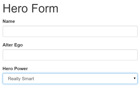
You don't see hero data because you're not binding to the Hero yet.
You know how to do that from earlier pages.
Displaying Data teaches property binding.
User Input shows how to listen for DOM events with an
event binding and how to update a component property with the displayed value.
因为还没有绑定到某个英雄,所以看不到任何数据。 解决方案见前面的章节。 显示数据介绍了属性绑定。 用户输入介绍了如何通过事件绑定来监听 DOM 事件,以及如何用显示值更新组件的属性。
Now you need to display, listen, and extract at the same time.
现在,需要同时进行显示、监听和提取。
You could use the techniques you already know, but
instead you'll use the new [(ngModel)] syntax, which
makes binding the form to the model easy.
虽然可以在表单中再次使用这些技术。
但是,这里将介绍个新东西,[(ngModel)]语法,使表单绑定到模型的工作变得超级简单。
Find the <input> tag for Name and update it like this:
找到 Name 对应的<input>标签,并且像这样修改它:
src/app/hero-form.component.html (excerpt)
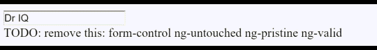
You added a diagnostic interpolation after the input tag so you can see what you're doing. You left yourself a note to throw it away when you're done.
在 input 标签后添加用于诊断的插值表达式,以看清正在发生什么事。 给自己留个备注,提醒我们完成后移除它。
Focus on the binding syntax: [(ngModel)]="...".
聚焦到绑定语法[(ngModel)]="..."上。
You need one more addition to display the data. Declare
a template variable for the form. Update the <form> tag with
#heroForm="ngForm" as follows:
我们需要更多的工作来显示数据。在表单中声明一个模板变量。往<form>标签中加入#heroForm="ngForm",代码如下:
src/app/hero-form.component.html (excerpt)
The variable heroForm is now a reference to the NgForm directive that governs the form as a whole.
heroForm变量是一个到NgForm指令的引用,它代表该表单的整体。
The NgForm directive
NgForm指令
What NgForm directive?
You didn't add an NgForm directive.
什么是NgForm指令?
但我们明明没有添加过NgForm指令啊!
Angular did. Angular automatically creates and attaches an NgForm directive to the <form> tag.
Angular替你做了。Angular会在<form>标签上自动创建并附加一个NgForm指令。
The NgForm directive supplements the form element with additional features.
It holds the controls you created for the elements with an ngModel directive
and name attribute, and monitors their properties, including their validity.
It also has its own valid property which is true only if every contained
control is valid.
NgForm指令为form增补了一些额外特性。
它会控制那些带有ngModel指令和name属性的元素,监听他们的属性(包括其有效性)。
它还有自己的valid属性,这个属性只有在它包含的每个控件都有效时才是真。
If you ran the app now and started typing in the Name input box, adding and deleting characters, you'd see them appear and disappear from the interpolated text. At some point it might look like this:
如果现在运行这个应用,开始在姓名输入框中键入,添加和删除字符,将看到它们从插值结果中显示和消失。 某一瞬间,它可能是这样的:
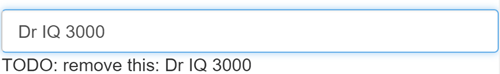
The diagnostic is evidence that values really are flowing from the input box to the model and back again.
诊断信息可以证明,数据确实从输入框流动到模型,再反向流动回来。
That's two-way data binding. For more information, see Two-way binding with NgModel on the the Template Syntax page.
这就是双向数据绑定!要了解更多信息,参见模板语法页的使用NgModel进行双向绑定。
Notice that you also added a name attribute to the <input> tag and set it to "name",
which makes sense for the hero's name. Any unique value will do, but using a descriptive name is helpful.
Defining a name attribute is a requirement when using [(ngModel)] in combination with a form.
注意,<input>标签还添加了name属性 (attribute),并设置为 "name",表示英雄的名字。
使用任何唯一的值都可以,但使用具有描述性的名字会更有帮助。
当在表单中使用[(ngModel)]时,必须要定义name属性。
Internally, Angular creates FormControl instances and
registers them with an NgForm directive that Angular attached to the <form> tag.
Each FormControl is registered under the name you assigned to the name attribute.
Read more in the previous section, The NgForm directive.
在内部,Angular 创建了一些FormControl,并把它们注册到NgForm指令,再将该指令附加到<form>标签。
注册每个FormControl时,使用name属性值作为键值。本章后面会讨论NgForm。
Add similar [(ngModel)] bindings and name attributes to Alter Ego and Hero Power.
You'll ditch the input box binding message
and add a new binding (at the top) to the component's diagnostic property.
Then you can confirm that two-way data binding works for the entire hero model.
为第二人格和超能力属性添加类似的[(ngModel)]绑定和name属性。
抛弃输入框的绑定消息,在组件顶部添加到diagnostic属性的新绑定。
这样就能确认双向数据绑定在整个 Hero 模型上都能正常工作了。
After revision, the core of the form should look like this:
修改之后,这个表单的核心是这样的:
src/app/hero-form.component.html (excerpt)
Each input element has an
idproperty that is used by thelabelelement'sforattribute to match the label to its input control.每个 input 元素都有
id属性,label元素的for属性用它来匹配到对应的输入控件。Each input element has a
nameproperty that is required by Angular forms to register the control with the form.每个 input 元素都有
name属性,Angular 表单用它注册控件。
If you run the app now and change every hero model property, the form might display like this:
如果现在运行本应用,修改 Hero 模型的每个属性,表单是这样的:
The diagnostic near the top of the form confirms that all of your changes are reflected in the model.
表单顶部的诊断信息反映出所做的一切更改。
Delete the {{diagnostic}} binding at the top as it has served its purpose.
表单顶部的{{diagnostic}}绑定已经完成了它的使命,删除它。
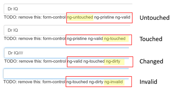
Track control state and validity with ngModel
通过 ngModel 跟踪修改状态与有效性验证
Using ngModel in a form gives you more than just two-way data binding. It also tells
you if the user touched the control, if the value changed, or if the value became invalid.
在表单中使用ngModel可以获得比仅使用双向数据绑定更多的控制权。它还会告诉我们很多信息:用户碰过此控件吗?它的值变化了吗?数据变得无效了吗?
The NgModel directive doesn't just track state; it updates the control with special Angular CSS classes that reflect the state. You can leverage those class names to change the appearance of the control.
NgModel 指令不仅仅跟踪状态。它还使用特定的 Angular CSS 类来更新控件,以反映当前状态。 可以利用这些 CSS 类来修改控件的外观,显示或隐藏消息。
State 状态 | Class if true 为真时的 CSS 类 | Class if false 为假时的 CSS 类 |
|---|---|---|
The control has been visited. 控件被访问过。 | ng-touched | ng-untouched |
The control's value has changed. 控件的值变化了。 | ng-dirty | ng-pristine |
| The control's value is valid. 控件的值有效。 | ng-valid | ng-invalid |
Temporarily add a template reference variable named spy
to the Name <input> tag and use it to display the input's CSS classes.
往姓名<input>标签上添加名叫 spy 的临时模板引用变量,
然后用这个 spy 来显示它上面的所有 CSS 类。
src/app/hero-form.component.html (excerpt)
Now run the app and look at the Name input box. Follow these steps precisely:
现在,运行本应用,并让姓名输入框获得焦点。 然后严格按照下面四个步骤来做:
Look but don't touch.
查看输入框,但别碰它。
Click inside the name box, then click outside it.
点击输入框,然后点击输入框外面。
Add slashes to the end of the name.
在名字的末尾添加些斜杠。
Erase the name.
删除名字。
The actions and effects are as follows:
动作和它对应的效果如下:
You should see the following transitions and class names:
我们会看到下列转换及其类名:
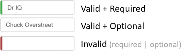
The ng-valid/ng-invalid pair is the most interesting, because you want to send a
strong visual signal when the values are invalid. You also want to mark required fields.
To create such visual feedback, add definitions for the ng-* CSS classes.
(ng-valid | ng-invalid)这一对是我们最感兴趣的。当数据变得无效时,我们希望发出强力的视觉信号,
还想要标记出必填字段。可以通过加入自定义 CSS 来提供视觉反馈。
Delete the #spy template reference variable and the TODO as they have served their purpose.
删除模板引用变量#spy和TODO,因为它们已经完成了使命。
Add custom CSS for visual feedback
添加用于视觉反馈的自定义 CSS
You can mark required fields and invalid data at the same time with a colored bar on the left of the input box:
可以在输入框的左侧添加带颜色的竖条,用于标记必填字段和无效输入:
You achieve this effect by adding these class definitions to a new forms.css file
that you add to the project as a sibling to index.html:
在新建的forms.css文件中,添加两个样式来实现这一效果。把这个文件添加到项目中,与index.html相邻。
src/forms.css
Update the <head> of index.html to include this style sheet:
更新index.html中的<head>,以包含这个样式表:
src/index.html (styles)
Show and hide validation error messages
显示和隐藏验证错误信息
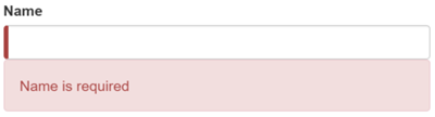
You can improve the form. The Name input box is required and clearing it turns the bar red. That says something is wrong but the user doesn't know what is wrong or what to do about it. Leverage the control's state to reveal a helpful message.
我们能做的更好。“Name” 输入框是必填的,清空它会让左侧的条变红。这表示某些东西是错的,但我们不知道错在哪里,或者如何纠正。
可以借助ng-invalid类来给出有用的提示。
When the user deletes the name, the form should look like this:
当用户删除姓名时,应该是这样的:
To achieve this effect, extend the <input> tag with the following:
要达到这个效果,在<input>标签中添加:
The "is required" message in a nearby
<div>, which you'll display only if the control is invalid.“is required”消息,放在邻近的
<div>元素中,只有当控件无效时,才显示它。
Here's an example of an error message added to the name input box:
这个例子中我们把一条错误信息添加到了name输入框中:
src/app/hero-form.component.html (excerpt)
You need a template reference variable to access the input box's Angular control from within the template.
Here you created a variable called name and gave it the value "ngModel".
模板引用变量可以访问模板中输入框的 Angular 控件。
这里,创建了名叫name的变量,并且赋值为 "ngModel"。
Why "ngModel"?
A directive's exportAs property
tells Angular how to link the reference variable to the directive.
You set name to ngModel because the ngModel directive's exportAs property happens to be "ngModel".
为什么是 “ngModel”?
指令的 exportAs 属性告诉 Angular 如何链接模板引用变量到指令。
这里把name设置为ngModel是因为ngModel指令的exportAs属性设置成了 “ngModel”。
You control visibility of the name error message by binding properties of the name
control to the message <div> element's hidden property.
我们把div元素的hidden属性绑定到name控件的属性,这样就可以控制“姓名”字段错误信息的可见性了。
In this example, you hide the message when the control is valid or pristine; "pristine" means the user hasn't changed the value since it was displayed in this form.
上例中,当控件是有效的 (valid) 或全新的 (pristine) 时,隐藏消息。 “全新的”意味着从它被显示在表单中开始,用户还从未修改过它的值。
This user experience is the developer's choice. Some developers want the message to display at all times.
If you ignore the pristine state, you would hide the message only when the value is valid.
If you arrive in this component with a new (blank) hero or an invalid hero,
you'll see the error message immediately, before you've done anything.
这种用户体验取决于开发人员的选择。有些人会希望任何时候都显示这条消息。
如果忽略了pristine状态,就会只在值有效时隐藏此消息。
如果往这个组件中传入全新(空)的英雄,或者无效的英雄,将立刻看到错误信息 —— 虽然我们还啥都没做。
Some developers want the message to display only when the user makes an invalid change. Hiding the message while the control is "pristine" achieves that goal. You'll see the significance of this choice when you add a new hero to the form.
有些人会为这种行为感到不安。它们希望只有在用户做出无效的更改时才显示这个消息。 如果当控件是“全新”状态时也隐藏消息,就能达到这个目的。 在往表单中添加新英雄时,将看到这种选择的重要性。
The hero Alter Ego is optional so you can leave that be.
英雄的第二人格是可选项,所以不用改它。
Hero Power selection is required.
You can add the same kind of error handling to the <select> if you want,
but it's not imperative because the selection box already constrains the
power to valid values.
英雄的超能力选项是必填的。
只要愿意,可以往<select>上添加相同的错误处理。
但没有必要,这个选择框已经限制了“超能力”只能选有效值。
Now you'll add a new hero in this form.
Place a New Hero button at the bottom of the form and bind its click event to a newHero component method.
我们希望在这个表单中添加新的英雄。
在表单的底部放置“New Hero(新增英雄)”按钮,并把它的点击事件绑定到newHero组件。
src/app/hero-form.component.html (New Hero button)
src/app/hero-form.component.ts (New Hero method)
Run the application again, click the New Hero button, and the form clears.
The required bars to the left of the input box are red, indicating invalid name and power properties.
That's understandable as these are required fields.
The error messages are hidden because the form is pristine; you haven't changed anything yet.
再次运行应用,点击 New Hero 按钮,表单被清空了。
输入框左侧的必填项竖条是红色的,表示name和power属性是无效的。
这可以理解,因为有一些必填字段。
错误信息是隐藏的,因为表单还是全新的,还没有修改任何东西。
Enter a name and click New Hero again. The app displays a Name is required error message. You don't want error messages when you create a new (empty) hero. Why are you getting one now?
输入名字,再次点击 New Hero 按钮。 这次,出现了错误信息!为什么?我们不希望显示新(空)的英雄时,出现错误信息。
Inspecting the element in the browser tools reveals that the name input box is no longer pristine. The form remembers that you entered a name before clicking New Hero. Replacing the hero did not restore the pristine state of the form controls.
使用浏览器工具审查这个元素就会发现,这个 name 输入框并不是全新的。 表单记得我们在点击 New Hero 前输入的名字。 更换了英雄并不会重置控件的“全新”状态。
You have to clear all of the flags imperatively, which you can do
by calling the form's reset() method after calling the newHero() method.
我们必须清除所有标记,在调用newHero()方法后调用表单的reset()方法即可。
src/app/hero-form.component.html (Reset the form)
Now clicking "New Hero" resets both the form and its control flags.
现在点击“New Hero”重设表单和它的控制标记。
Submit the form with ngSubmit
使用 ngSubmit 提交该表单
The user should be able to submit this form after filling it in.
The Submit button at the bottom of the form
does nothing on its own, but it will
trigger a form submit because of its type (type="submit").
在填表完成之后,用户还应该能提交这个表单。
“Submit(提交)”按钮位于表单的底部,它自己不做任何事,但因为有特殊的 type 值 (type="submit"),所以会触发表单提交。
A "form submit" is useless at the moment.
To make it useful, bind the form's ngSubmit event property
to the hero form component's onSubmit() method:
现在这样仅仅触发“表单提交”是没用的。
要让它有用,就要把该表单的ngSubmit事件属性绑定到英雄表单组件的onSubmit()方法上:
You'd already defined a template reference variable,
#heroForm, and initialized it with the value "ngForm".
Now, use that variable to access the form with the Submit button.
我们已经定义了一个模板引用变量#heroForm,并且把赋值为“ngForm”。
现在,就可以在“Submit”按钮中访问这个表单了。
You'll bind the form's overall validity via
the heroForm variable to the button's disabled property
using an event binding. Here's the code:
我们要把表单的总体有效性通过heroForm变量绑定到此按钮的disabled属性上,代码如下:
If you run the application now, you find that the button is enabled—although it doesn't do anything useful yet.
重新运行应用。表单打开时,状态是有效的,按钮是可用的。
Now if you delete the Name, you violate the "required" rule, which is duly noted in the error message. The Submit button is also disabled.
现在,如果我们删除姓名,就会违反“必填姓名”规则,就会像以前那样显示出错误信息。同时,Submit 按钮也被禁用了。
Not impressed? Think about it for a moment. What would you have to do to wire the button's enable/disabled state to the form's validity without Angular's help?
没感动吗?再想一会儿。如果没有 Angular NgForm的帮助,又该怎么让按钮的禁用/启用状态和表单的有效性关联起来呢?
For you, it was as simple as this:
有了 Angular,它就是这么简单:
Define a template reference variable on the (enhanced) form element.
定义模板引用变量,放在(强化过的)form 元素上
Refer to that variable in a button many lines away.
从很多行之外的按钮上引用这个变量。
Toggle two form regions (extra credit)
切换两个表单区域(额外的奖励)
Submitting the form isn't terribly dramatic at the moment.
提交表单还是不够激动人心。
An unsurprising observation for a demo. To be honest, jazzing it up won't teach you anything new about forms. But this is an opportunity to exercise some of your newly won binding skills. If you aren't interested, skip to this page's conclusion.
对演示来说,这个收场很平淡的。老实说,即使让它更出彩,也无法教给我们任何关于表单的新知识。 但这是练习新学到的绑定技能的好机会。 如果你不感兴趣,可以跳到本章的总结部分。
For a more strikingly visual effect, hide the data entry area and display something else.
来实现一些更炫的视觉效果吧。 隐藏掉数据输入框,显示一些其它东西。
Wrap the form in a <div> and bind
its hidden property to the HeroFormComponent.submitted property.
先把表单包裹进<div>中,再把它的hidden属性绑定到HeroFormComponent.submitted属性。
src/app/hero-form.component.html (excerpt)
The main form is visible from the start because the
submitted property is false until you submit the form,
as this fragment from the HeroFormComponent shows:
主表单从一开始就是可见的,因为submitted属性是 false,直到提交了这个表单。
来自HeroFormComponent的代码片段告诉了我们这一点:
src/app/hero-form.component.ts (submitted)
When you click the Submit button, the submitted flag becomes true and the form disappears
as planned.
当点击 Submit 按钮时,submitted标志会变成 true,并且表单像预想中一样消失了。
Now the app needs to show something else while the form is in the submitted state.
Add the following HTML below the <div> wrapper you just wrote:
现在,当表单处于已提交状态时,需要显示一些别的东西。
在刚刚写的<div>包装下方,添加下列 HTML 语句:
src/app/hero-form.component.html (excerpt)
There's the hero again, displayed read-only with interpolation bindings.
This <div> appears only while the component is in the submitted state.
英雄又出现了,它通过插值表达式绑定显示为只读内容。 这一小段 HTML 只在组件处于已提交状态时才会显示。
The HTML includes an Edit button whose click event is bound to an expression
that clears the submitted flag.
这段HTML包含一个 “Edit(编辑)”按钮,将 click 事件绑定到表达式,用于清除submitted标志。
When you click the Edit button, this block disappears and the editable form reappears.
当点Edit按钮时,这个只读块消失了,可编辑的表单重新出现了。
Conclusion
结论
The Angular form discussed in this page takes advantage of the following framework features to provide support for data modification, validation, and more:
本章讨论的 Angular 表单技术利用了下列框架特性来支持数据修改、验证和更多操作:
An Angular HTML form template.
Angular HTML 表单模板。
A form component class with a
@Componentdecorator.带有
@Component装饰器的表单组件类。Handling form submission by binding to the
NgForm.ngSubmitevent property.通过绑定到
NgForm.ngSubmit事件属性来处理表单提交。Template-reference variables such as
#heroFormand#name.模板引用变量,例如
#heroForm和#name。[(ngModel)]syntax for two-way data binding.[(ngModel)]语法用来实现双向数据绑定。The use of
nameattributes for validation and form-element change tracking.name属性的用途是有效性验证和对表单元素的变更进行追踪。The reference variable’s
validproperty on input controls to check if a control is valid and show/hide error messages.指向 input 控件的引用变量上的
valid属性,可用于检查控件是否有效、是否显示/隐藏错误信息。Controlling the Submit button's enabled state by binding to
NgFormvalidity.通过绑定到
NgForm的有效性状态,控制Submit按钮的禁用状态。Custom CSS classes that provide visual feedback to users about invalid controls.
定制 CSS 类来给用户提供无效控件的视觉反馈。
The final project folder structure should look like this:
最终的项目目录结构是这样的:
Here’s the code for the final version of the application:
这里是源码的最终版本: