Motion is an important aspect in the design of modern web applications. Good user interfaces transition smoothly between states with engaging animations that call attention where it's needed. Well-designed animations can make a UI not only more fun but also easier to use.
动画是现代Web应用设计中一个很重要的方面。我们希望用户界面能在不同的状态之间更平滑的转场。如果需要,还可以用适当的动画来吸引注意力。 设计良好的动画不但会让UI更有趣,还会让它更容易使用。
Angular's animation system lets you build animations that run with the same kind of native performance found in pure CSS animations. You can also tightly integrate your animation logic with the rest of your application code, for ease of control.
Angular的动画系统赋予了制作各种动画效果的能力,以构建出与原生CSS动画性能相同的动画。 我们也获得了额外的让动画逻辑与其它应用代码紧紧集成在一起的能力,这让动画可以被更容易的触发与控制。
Angular animations are built on top of the standard Web Animations API and run natively on browsers that support it.
Angular动画是基于标准的Web动画API(Web Animations API)构建的,它们在支持此API的浏览器中会用原生方式工作。
For other browsers, a polyfill is required. Grab
web-animations.min.js from GitHub and
add it to your page.
至于其它浏览器,就需要一个填充库(polyfill)了。你可以从这里获取web-animations.min.js,并把它加入你的页面中。
Contents
目录
The examples in this page are available as a
本章中引用的这个例子可以到
Quickstart example: Transitioning between two states
快速起步范例:在两个状态间转场
You can build a simple animation that transitions an element between two states driven by a model attribute.
我们来构建一个简单的动画,它会让一个元素用模型驱动的方式在两个状态之间转场。
Animations are defined inside @Component metadata. Before you can add animations, you need
to import a few animation-specific imports and functions:
动画会被定义在@Component元数据中。在添加动画之前,先引入一些与动画有关的函数:
app.module.ts (@NgModule imports excerpt)
hero-list-basic.component.ts
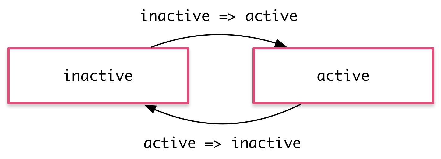
With these, you can define an animation trigger called heroState in the component
metadata. It uses animations to transition between two states: active and inactive. When a
hero is active, the element appears in a slightly larger size and lighter color.
通过这些,可以在组件元数据中定义一个名叫heroState的动画触发器。它在两个状态active和inactive之间进行转场。
当英雄处于激活状态时,它会把该元素显示得稍微大一点、亮一点。
hero-list-basic.component.ts (@Component excerpt)
In this example, you are defining animation styles (color and transform) inline in the animation metadata.
在这个例子中,我们在元数据中用内联的方式定义了动画样式(color和transform)。在即将到来的一个Angular版本中,还将支持从组件的CSS样式表中提取样式。
Now, using the [@triggerName] syntax, attach the animation that you just defined to
one or more elements in the component's template.
我们刚刚定义了一个动画,但它还没有被用到任何地方。要想使用它,可以在模板中用[@triggerName]语法来把它附加到一个或多个元素上。
hero-list-basic.component.ts (excerpt)
Here, the animation trigger applies to every element repeated by an ngFor. Each of
the repeated elements animates independently. The value of the
attribute is bound to the expression hero.state and is always either active or inactive.
这里,我们把该动画触发器添加到了由ngFor重复出来的每一个元素上。每个重复出来的元素都有独立的动画效果。
然后把@triggerName属性(Attribute)的值设置成表达式hero.state。这个值应该或者是inactive或者是active,因为我们刚刚为它们俩定义过动画状态。
With this setup, an animated transition appears whenever a hero object changes state. Here's the full component implementation:
通过这些设置,一旦英雄对象的状态发生了变化,就会触发一个转场动画。下面是完整的组件实现:
hero-list-basic.component.ts
States and transitions
状态与转场
Angular animations are defined as logical states and transitions between states.
Angular动画是由状态和状态之间的转场效果所定义的。
An animation state is a string value that you define in your application code. In the example
above, the states 'active' and 'inactive' are based on the logical state of
hero objects. The source of the state can be a simple object attribute, as it was in this case,
or it can be a value computed in a method. The important thing is that you can read it into the
component's template.
动画状态是一个由程序代码中定义的字符串值。在上面的例子中,基于英雄对象的逻辑状态,我们使用了'active'和'inactive'这两种状态。
状态的来源可以是像本例中这样简单的对象属性,也可以是由方法计算出来的值。重点是,我们得能从组件模板中读取它。
We can define styles for each animation state:
我们可以为每个动画状态定义了一组样式:
These state definitions specify the end styles of each state.
They are applied to the element once it has transitioned to that state, and stay
as long as it remains in that state. In effect, you're defining what styles the element has in different states.
这些state具体定义了每个状态的最终样式。一旦元素转场到那个状态,该样式就会被应用到此元素上,当它留在此状态时,这些样式也会一直保持着。
从这个意义上讲,这里其实并不只是在定义动画,而是在定义该元素在不同状态时应该具有的样式。
After you define states, you can define transitions between the states. Each transition controls the timing of switching between one set of styles and the next:
定义完状态,就能定义在状态之间的各种转场了。每个转场都会控制一条在一组样式和下一组样式之间切换的时间线:
If several transitions have the same timing configuration, you can combine
them into the same transition definition:
如果多个转场都有同样的时间线配置,就可以把它们合并进同一个transition定义中:
When both directions of a transition have the same timing, as in the previous
example, you can use the shorthand syntax <=>:
如果要对同一个转场的两个方向都使用相同的时间线(就像前面的例子中那样),就可以使用<=>这种简写语法:
You can also apply a style during an animation but not keep it around
after the animation finishes. You can define such styles inline, in the transition. In this example,
the element receives one set of styles immediately and is then animated to the next.
When the transition finishes, none of these styles are kept because they're not
defined in a state.
有时希望一些样式只在动画期间生效,但在结束后并不保留它们。这时可以把这些样式内联在transition中进行定义。
在这个例子中,该元素会立刻获得一组样式,然后动态转场到下一个状态。当转场结束时,这些样式并不会被保留,因为它们并没有被定义在state中。
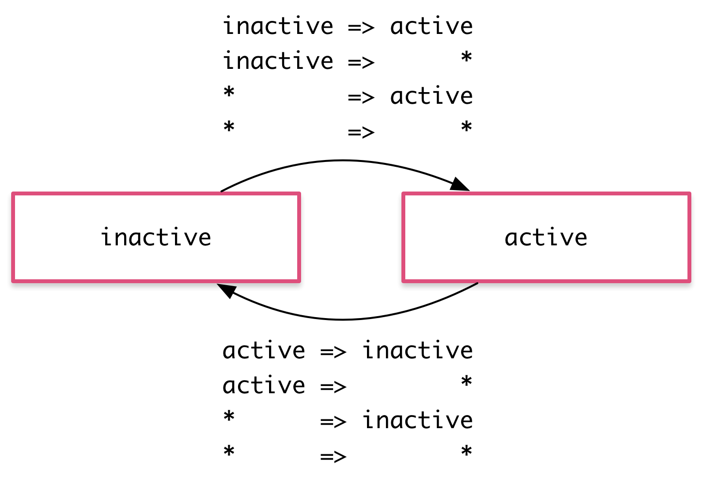
The wildcard state *
*(通配符)状态
The * ("wildcard") state matches any animation state. This is useful for defining styles and
transitions that apply regardless of which state the animation is in. For example:
*(通配符)状态匹配任何动画状态。当定义那些不需要管当前处于什么状态的样式及转场时,这很有用。比如:
The
active => *transition applies when the element's state changes fromactiveto anything else.当该元素的状态从
active变成任何其它状态时,active => *转场都会生效。The
* => *transition applies when any change between two states takes place.当在任意两个状态之间切换时,
* => *转场都会生效。
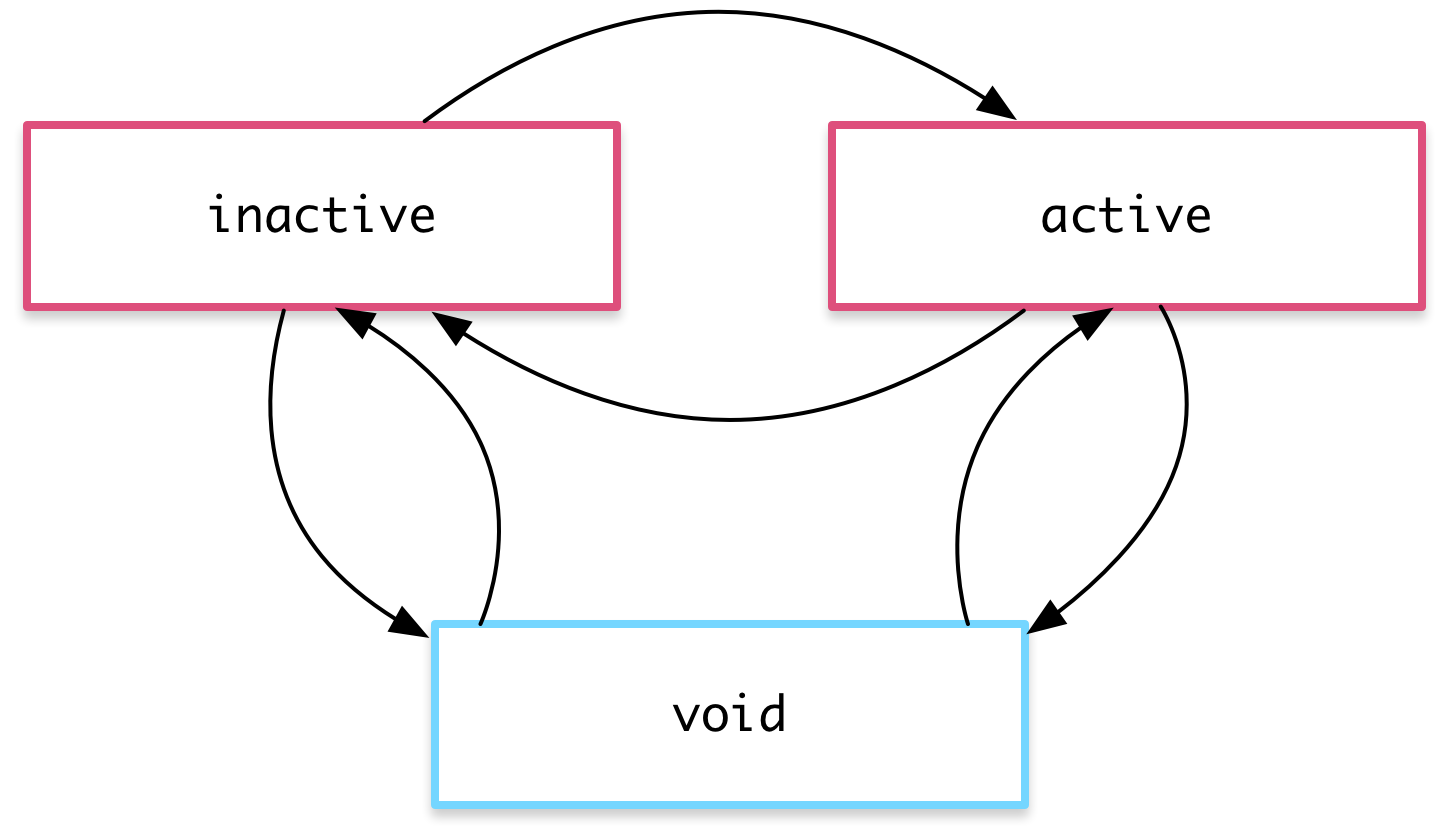
The void state
void状态
The special state called void can apply to any animation. It applies
when the element is not attached to a view, perhaps because it has not yet been
added or because it has been removed. The void state is useful for defining enter and
leave animations.
有一种叫做void的特殊状态,它可以应用在任何动画中。它表示元素没有被附加到视图。这种情况可能是由于它尚未被添加进来或者已经被移除了。
void状态在定义“进场”和“离场”的动画时会非常有用。
For example the * => void transition applies when the element leaves the view,
regardless of what state it was in before it left.
比如当一个元素离开视图时,* => void转场就会生效,而不管它在离场以前是什么状态。
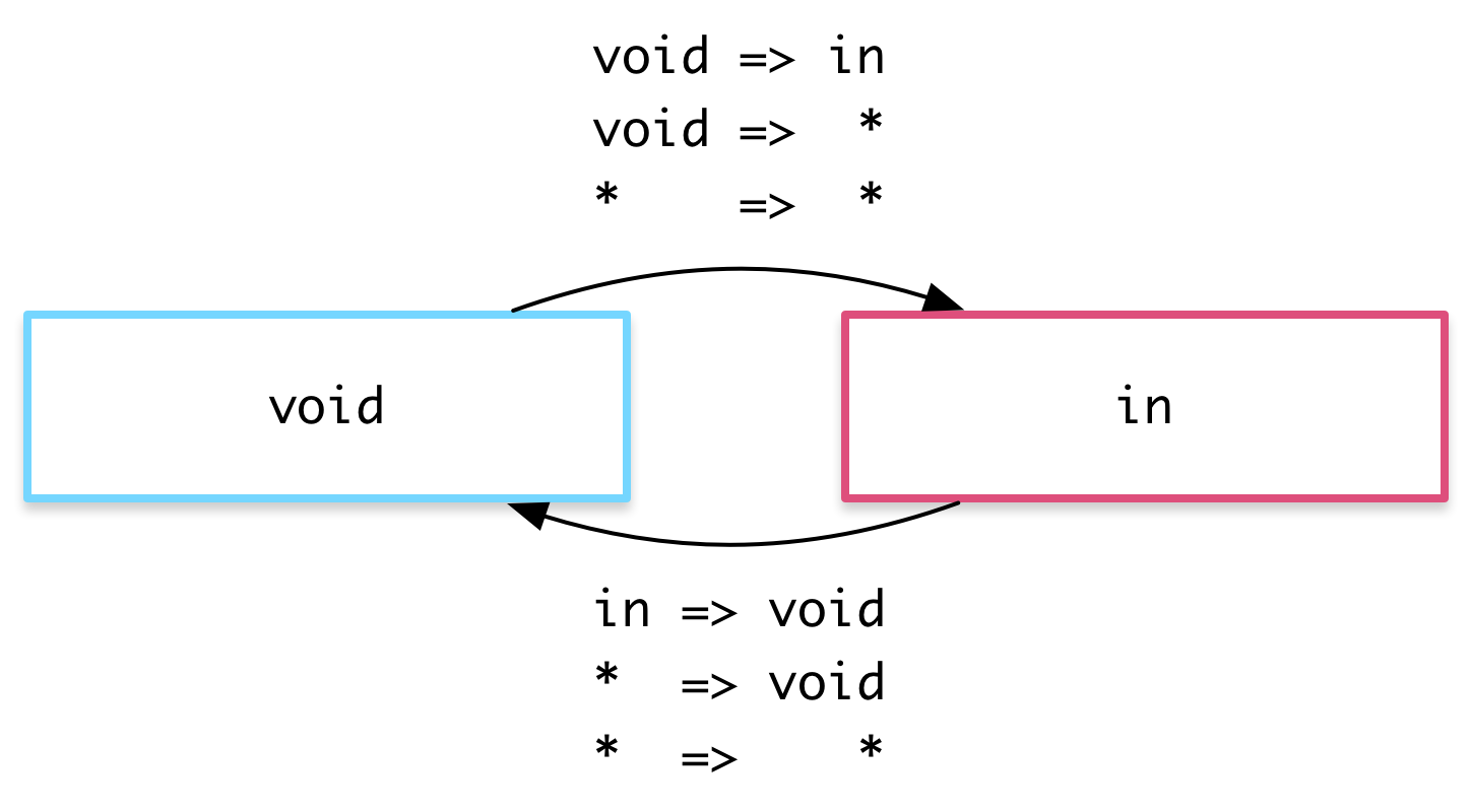
The wildcard state * also matches void.
*通配符状态也能匹配void。
Example: Entering and leaving
例子:进场与离场

Using the void and * states you can define transitions that animate the
entering and leaving of elements:
使用void和*状态,可以定义元素进场与离场时的转场动画:
Enter:
void => *进场:
void => *Leave:
* => void离场:
* => void
For example, in the animations array below there are two transitions that use
the void => * and * => void syntax to animate the element in and out of the view.
例如,在下面的animations数组中,这两个转场语句使用void => *和* => void语法来让该元素以动画形式进入和离开当前视图。
hero-list-enter-leave.component.ts (excerpt)
Note that in this case the styles are applied to the void state directly in the
transition definitions, and not in a separate state(void) definition. Thus, the transforms
are different on enter and leave: the element enters from the left
and leaves to the right.
注意,在这个例子中,这些样式在转场定义中被直接应用到了void状态,但并没有一个单独的state(void)定义。
这么做是因为希望在进场与离场时使用不一样的转换效果:元素从左侧进场,从右侧离开。
These two common animations have their own aliases:
这两个常见的动画有自己的别名:
Example: Entering and leaving from different states
范例:从不同的状态下进场和离场

You can also combine this animation with the earlier state transition animation by using the hero state as the animation state. This lets you configure different transitions for entering and leaving based on what the state of the hero is:
通过把英雄的状态用作动画的状态,还能把该动画跟以前的转场动画组合成一个复合动画。这让我们能根据该英雄的当前状态为其配置不同的进场与离场动画:
Inactive hero enter:
void => inactive非激活英雄进场:
void => inactiveActive hero enter:
void => active激活英雄进场:
void => activeInactive hero leave:
inactive => void非激活英雄离场:
inactive => voidActive hero leave:
active => void激活英雄离场:
active => void
This gives you fine-grained control over each transition:
现在就对每一种转场都有了细粒度的控制:
hero-list-enter-leave.component.ts (excerpt)
Animatable properties and units
可动的(Animatable)属性与单位
Since Angular's animation support builds on top of Web Animations, you can animate any property that the browser considers animatable. This includes positions, sizes, transforms, colors, borders, and many others. The W3C maintains a list of animatable properties on its CSS Transitions page.
由于Angular的动画支持是基于Web Animations标准的,所以也能支持浏览器认为可以参与动画的任何属性。这些属性包括位置(position)、大小(size)、变换(transform)、颜色(color)、边框(border)等很多属性。W3C维护着 一个“可动”属性列表。
For positional properties that have a numeric value, you can define a unit by providing the value as a string with the appropriate suffix:
尺寸类属性(如位置、大小、边框等)包括一个数字值和一个用来定义长度单位的后缀:
'50px''3em''100%'
If you don't provide a unit when specifying dimension, Angular assumes the default of px:
对大多数尺寸类属性而言,还能只定义一个数字,那就表示它使用的是像素(px)数:
50is the same as saying'50px'50相当于'50px'
Automatic property calculation
自动属性值计算

Sometimes you don't know the value of a dimensional style property until runtime. For example, elements often have widths and heights that depend on their content and the screen size. These properties are often tricky to animate with CSS.
有时候,我们想在动画中使用的尺寸类样式,它的值在开始运行之前都是不可知的。比如,元素的宽度和高度往往依赖于它们的内容和屏幕的尺寸。处理这些属性对CSS动画而言通常是相当棘手的。
In these cases, you can use a special * property value so that the value of the
property is computed at runtime and then plugged into the animation.
如果用Angular动画,就可以用一个特殊的*属性值来处理这种情况。该属性的值将会在运行期被计算出来,然后插入到这个动画中。
In this example, the leave animation takes whatever height the element has before it leaves and animates from that height to zero:
这个例子中的“离场”动画会取得该元素在离场前的高度,并且把它从这个高度用动画转场到0高度:
Animation timing
动画时间线
There are three timing properties you can tune for every animated transition: the duration, the delay, and the easing function. They are all combined into a single transition timing string.
对每一个动画转场效果,有三种时间线属性可以调整:持续时间(duration)、延迟(delay)和缓动(easing)函数。它们被合并到了一个单独的转场时间线字符串。
Duration
持续时间
The duration controls how long the animation takes to run from start to finish. You can define a duration in three ways:
持续时间控制动画从开始到结束要花多长时间。可以用三种方式定义持续时间:
As a plain number, in milliseconds:
100作为一个普通数字,以毫秒为单位,如:
100In a string, as milliseconds:
'100ms'作为一个字符串,以毫秒为单位,如:
'100ms'In a string, as seconds:
'0.1s'作为一个字符串,以秒为单位,如:
'0.1s'
Delay
延迟
The delay controls the length of time between the animation trigger and the beginning of the transition. You can define one by adding it to the same string following the duration. It also has the same format options as the duration:
延迟控制的是在动画已经触发但尚未真正开始转场之前要等待多久。可以把它添加到字符串中的持续时间后面,它的选项格式也跟持续时间是一样的:
Wait for 100ms and then run for 200ms:
'0.2s 100ms'等待100毫秒,然后运行200毫秒:
'0.2s 100ms'。
Easing
缓动函数
The easing function controls how the animation accelerates
and decelerates during its runtime. For example, an ease-in function causes
the animation to begin relatively slowly but pick up speed as it progresses. You
can control the easing by adding it as a third value in the string after the duration
and the delay (or as the second value when there is no delay):
缓动函数用于控制动画在运行期间如何加速和减速。比如:使用ease-in函数意味着动画开始时相对缓慢,然后在进行中逐步加速。可以通过在这个字符串中的持续时间和延迟后面添加第三个值来控制使用哪个缓动函数(如果没有定义延迟就作为第二个值)。
Wait for 100ms and then run for 200ms, with easing:
'0.2s 100ms ease-out'等待100毫秒,然后运行200毫秒,并且带缓动:
'0.2s 100ms ease-out'Run for 200ms, with easing:
'0.2s ease-in-out'运行200毫秒,并且带缓动:
'0.2s ease-in-out'

Example
例子
Here are a couple of custom timings in action. Both enter and leave last for
200 milliseconds, that is 0.2s, but they have different easings. The leave begins after a
slight delay of 10 milliseconds as specified in '0.2s 10 ease-out':
这里是两个自定义时间线的动态演示。“进场”和“离场”都持续200毫秒,也就是0.2s,但它们有不同的缓动函数。“离场”动画会在100毫秒的延迟之后开始,也就是'0.2s 10 ease-out':
hero-list-timings.component.ts (excerpt)
Multi-step animations with keyframes
基于关键帧(Keyframes)的多阶段动画

Animation keyframes go beyond a simple transition to a more intricate animation that goes through one or more intermediate styles when transitioning between two sets of styles.
通过定义动画的关键帧,可以把两组样式之间的简单转场,升级成一种更复杂的动画,它会在转场期间经历一个或多个中间样式。
For each keyframe, you specify an offset that defines at which point in the animation that keyframe applies. The offset is a number between zero, which marks the beginning of the animation, and one, which marks the end.
每个关键帧都可以被指定一个偏移量,用来定义该关键帧将被用在动画期间的哪个时间点。偏移量是一个介于0(表示动画起点)和1(表示动画终点)之间的数组。
This example adds some "bounce" to the enter and leave animations with keyframes:
在这个例子中,我们使用关键帧来为进场和离场动画添加一些“反弹效果”:
hero-list-multistep.component.ts (excerpt)
Note that the offsets are not defined in terms of absolute time. They are relative measures from zero to one. The final timeline of the animation is based on the combination of keyframe offsets, duration, delay, and easing.
注意,这个偏移量并不是用绝对数字定义的时间段,而是在0到1之间的相对值(百分比)。动画的最终时间线会基于关键帧的偏移量、持续时间、延迟和缓动函数计算出来。
Defining offsets for keyframes is optional. If you omit them, offsets with even
spacing are automatically assigned. For example, three keyframes without predefined
offsets receive offsets 0, 0.5, and 1.
为关键帧定义偏移量是可选的。如果省略它们,偏移量会自动根据帧数平均分布出来。例如,三个未定义过偏移量的关键帧会分别获得偏移量:0、0.5和1。
Parallel animation groups
并行动画组(Group)

You've seen how to animate multiple style properties at the same time:
just put all of them into the same style() definition.
我们已经知道该如何在同一时间段进行多个样式的动画了:只要把它们都放进同一个style()定义中就行了!
But you may also want to configure different timings for animations that happen in parallel. For example, you may want to animate two CSS properties but use a different easing function for each one.
但我们也可能会希望为同时发生的几个动画配置不同的时间线。比如,同时对两个CSS属性做动画,但又得为它们定义不同的缓动函数。
For this you can use animation groups. In this example, using groups both on enter and leave allows for two different timing configurations. Both are applied to the same element in parallel, but run independently of each other:
这种情况下就可以用动画组来解决了。在这个例子中,我们同时在进场和离场时使用了组,以便能让它们使用两种不同的时间线配置。 它们被同时应用到同一个元素上,但又彼此独立运行:
hero-list-groups.component.ts (excerpt)
One group animates the element transform and width; the other group animates the opacity.
其中一个动画组对元素的transform和width做动画,另一个组则对opacity做动画。
Animation callbacks
动画回调
A callback is fired when an animation is started and also when it is done.
当动画开始和结束时,会触发一个回调。
In the keyframes example, you have a trigger called @flyInOut. You can hook
those callbacks like this:
对于例子中的这个关键帧,我们有一个叫做@flyInOut的trigger。在那里我们可以挂钩到那些回调,比如:
hero-list-multistep.component.ts (excerpt)
The callbacks receive an AnimationEvent that contains contains useful properties such as
fromState, toState and totalTime.
这些回调接收一个AnimationTransitionEvent参数,它包含一些有用的属性,例如fromState,toState和totalTime。
Those callbacks will fire whether or not an animation is picked up.
无论动画是否实际执行过,那些回调都会触发。