Our story needs more heroes. We’ll expand our Tour of Heroes app to display a list of heroes, allow the user to select a hero, and display the hero’s details.
Run the
Let’s take stock of what we’ll need to display a list of heroes. First, we need a list of heroes. We want to display those heroes in the view’s template, so we’ll need a way to do that.
Where We Left Off
Before we continue with Part 2 of the Tour of Heroes, let’s verify we have the following structure after Part 1. If not, we’ll need to go back to Part 1 and figure out what we missed.
Keep the app compiling and running
We want to start the Dart compiler, have it watch for changes, and start our server. We'll do this by typing
This will keep the application running while we continue to build the Tour of Heroes.
Displaying Our Heroes
Creating heroes
Let’s create a list of ten heroes at the bottom of app_component.dart.
app_component.dart (hero list)
The mockHeroes list is of type Hero, the class defined in part one,
to create a list of heroes.
We aspire to fetch this list of heroes from a web service, but let’s take small steps
first and display mock heroes.
Exposing heroes
Let’s create a public property in AppComponent that exposes the heroes for binding.
app_component.dart (hero list property)
We could have defined the heroes list here in this component class. But we know that ultimately we’ll get the heroes from a data service. Because we know where we are heading, it makes sense to separate the hero data from the class implementation from the start.
Displaying heroes in a template
Our component has heroes. Let’s create an unordered list in our template to display them.
We’ll insert the following chunk of HTML below the title and above the hero details.
app_component.dart (heroes template)
Now we have a template that we can fill with our heroes.
Listing heroes with ngFor
We want to bind the list of heroes in our component to our template, iterate over them,
and display them individually.
We’ll need some help from Angular to do this. Let’s do this step by step.
First modify the <li> tag by adding the built-in directive *ngFor.
app_component.dart (ngFor)
The leading asterisk (*) in front of ngFor is a critical part of this syntax.
The (*) prefix to ngFor indicates that the <li> element and its children
constitute a master template.
The ngFor directive iterates over the heroes list returned by the AppComponent.heroes property
and stamps out instances of this template.
The quoted text assigned to ngFor means
“take each hero in the heroes list, store it in the local hero variable,
and make it available to the corresponding template instance”.
The let keyword before "hero" identifies hero as a template input variable.
We can reference this variable within the template to access a hero’s properties.
Learn more about ngFor and template input variables in the
Displaying Data and
Template Syntax chapters.
Now we insert some content between the <li> tags
that uses the hero template variable to display the hero’s properties.
app_component.dart (ngFor template)
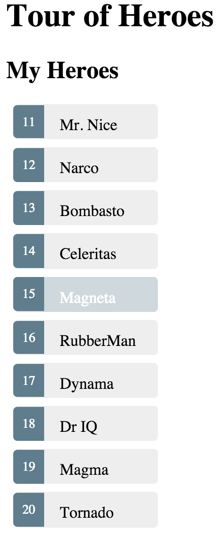
When the browser refreshes, we see a list of heroes!
Styling our heroes
Our list of heroes looks pretty bland. We want to make it visually obvious to a user which hero we are hovering over and which hero is selected.
Let’s add some styles to our component by setting the styles argument of the @Component annotation
to the following CSS classes:
app_component.dart (styles)
Notice that we again use the triple-quote notation for multi-line strings.
That's a lot of styles! We can put them inline as shown here, or we can move them out to their own file which will make it easier to code our component. We'll do this in a later chapter. For now let's keep rolling.
When we assign styles to a component they are scoped to that specific component.
Our styles will only apply to our AppComponent and won't "leak" to the outer HTML.
Our template for displaying the heroes should now look like this:
app_component.dart (styled heroes)
Selecting a Hero
We have a list of heroes and we have a single hero displayed in our app. The list and the single hero are not connected in any way. We want the user to select a hero from our list, and have the selected hero appear in the details view. This UI pattern is widely known as "master-detail". In our case, the master is the heroes list and the detail is the selected hero.
Let’s connect the master to the detail through a selectedHero component property bound to a click event.
Click event
We modify the <li> by inserting an Angular event binding to its click event.
app_component.dart (template excerpt)
Focus on the event binding
The parentheses identify the <li> element’s click event as the target.
The expression to the right of the equal sign calls the AppComponent method, onSelect(),
passing the template input variable hero as an argument.
That’s the same hero variable we defined previously in the ngFor.
Learn more about Event Binding in the User Input and Templating Syntax chapters.
Add the click handler
Our event binding refers to an onSelect method that doesn’t exist yet.
We’ll add that method to our component now.
What should that method do? It should set the component’s selected hero to the hero that the user clicked.
Our component doesn’t have a “selected hero” yet either. We’ll start there.
Expose the selected hero
We no longer need the static hero property of the AppComponent.
Replace it with this simple selectedHero property:
app_component.dart (selectedHero)
We’ve decided that none of the heroes should be selected before the user picks a hero so
we won’t initialize the selectedHero as we were doing with hero.
Now add an onSelect method that sets the selectedHero property to the hero the user clicked.
app_component.dart (onSelect)
We will be showing the selected hero's details in our template.
At the moment, it is still referring to the old hero property.
Let’s fix the template to bind to the new selectedHero property.
app_component.dart (template excerpt)
Hide the empty detail with ngIf
When our app loads we see a list of heroes, but a hero is not selected.
The selectedHero is undefined.
That’s why we'll see the following error in the browser’s console:
Remember that we are displaying selectedHero.name in the template.
This name property does not exist because selectedHero itself is undefined.
We'll address this problem by keeping the hero detail out of the DOM until there is a selected hero.
We wrap the HTML hero detail content of our template with a <div>.
Then we add the ngIf built-in directive and set it to the selectedHero property of our component.
app_component.dart (ngIf)
Remember that the leading asterisk (*) in front of ngIf is
a critical part of this syntax.
When there is no selectedHero, the ngIf directive removes the hero detail HTML from the DOM.
There will be no hero detail elements and no bindings to worry about.
When the user picks a hero, selectedHero isn't null anymore and
ngIf puts the hero detail content into the DOM and evaluates the nested bindings.
ngIf and ngFor are called “structural directives” because they can change the
structure of portions of the DOM.
In other words, they give structure to the way Angular displays content in the DOM.
Learn more about ngIf, ngFor and other structural directives in the
Structural Directives and
Template Syntax chapters.
The browser refreshes and we see the list of heroes but not the selected hero detail.
The ngIf keeps it out of the DOM as long as the selectedHero is undefined.
When we click on a hero in the list, the selected hero displays in the hero details.
Everything is working as we expect.
Styling the selection
We see the selected hero in the details area below but we can’t quickly locate that hero in the list above.
We can fix that by applying the selected CSS class to the appropriate <li> in the master list.
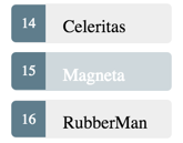
For example, when we select Magneta from the heroes list,
we can make it pop out visually by giving it a subtle background color as shown here.
We’ll add a property binding on class for the selected class to the template. We'll set this to an expression that compares the current selectedHero to the hero.
The key is the name of the CSS class (selected). The value is true if the two heroes match and false otherwise.
We’re saying “apply the selected class if the heroes match, remove it if they don’t”.
app_component.dart (setting the CSS class)
Notice in the template that the class.selected is surrounded in square brackets ([]).
This is the syntax for a property binding, a binding in which data flows one way
from the data source (the expression hero == selectedHero) to a property of class.
app_component.dart (styling each hero)
Learn more about property bindings in the Template Syntax chapter.
The browser reloads our app. We select the hero Magneta and the selection is clearly identified by the background color.
We select a different hero and the tell-tale color switches to that hero.
Here's the complete app_component.dart as it stands now:
app_component.dart
The Road We’ve Travelled
Here’s what we achieved in this chapter:
- Our Tour of Heroes now displays a list of selectable heroes
- We added the ability to select a hero and show the hero’s details
- We learned how to use the built-in directives
ngIfandngForin a component’s template
Run the
The Road Ahead
Our Tour of Heroes has grown, but it’s far from complete. We can't put the entire app into a single component. We need to break it up into sub-components and teach them to work together as we learn in the next chapter.